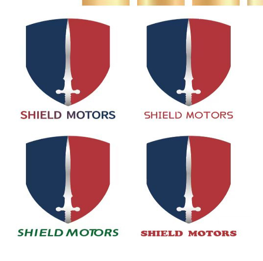


Saudi Arabian customer LOGO design
The SHIELD MOTORS brand visual logo, created by the Momei Printing Creative Laboratory, takes the "Shield and Sword Alliance" as its core creative idea, and condenses the safety gene and enterprising spirit of the logistics industry into a visual language. The shield-shaped outline adopts a dynamic streamline design, which not only shows the stability of the defense system, but also contains the speed aesthetics of breaking through the wind; the central sword blade totem is presented in a negative space technique, which not only symbolizes the precise and efficient logistics execution, but also coincides with the service philosophy of "shield protection".
The visual system innovatively adopts a dual-mode gradient background design: the cold silver-gray tone highlights the professional texture of scientific and technological logistics, and the warm amber gradient implies service temperature and growth momentum. The three-dimensional cutting process of the shield creates a sense of spatial depth in the plane, and with the dynamic sword pattern light effect design, the logo can generate multi-dimensional visual tension when presented in different media, perfectly interpreting the brand value triangle of "safe foundation, rapid victory, and intelligent drive".
Market evidence shows that within six months after the new logo was launched, the company's Middle East shipping volume exceeded 1.6 million tons, a year-on-year increase of 20%, and the customer satisfaction index increased by 18 percentage points. The brand premium effect brought by the visual upgrade has increased SHIELD MOTORS's bidding weight in hub ports such as Dubai and Doha by 15%, successfully ranking among the top regional logistics service providers.