

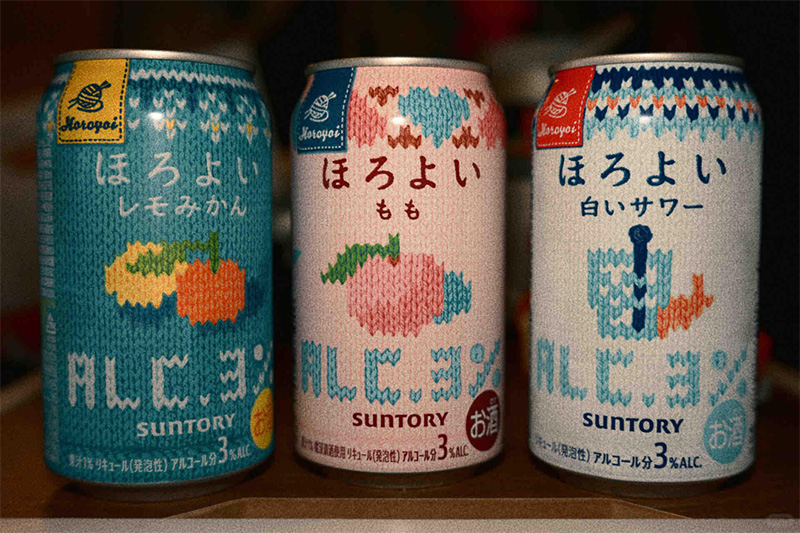


Suntory has given its drinks a "sweater" look! It's got that wintery vibe all set!
Dressing aluminum canned beverages in sweaters.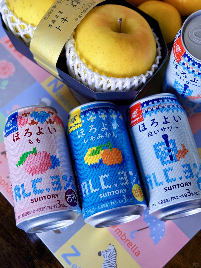
What seems warm is the beverage itself, but what truly warms is the heart.
The bottle's intricate knit texture mimics the weave of a sweater. While not altering the packaging material, it successfully creates a soft, inviting visual experience, so adorable that you can't help but want to buy a can and hold it in your hands.
Besides using sweater packaging to evoke a sense of "warmth" in consumers, the designer cleverly uses synesthesia to subtly convey the taste of the beverage.
This product series includes multiple flavors: lemon orange, peach, Calpis (a lactic acid bacteria beverage)...
In designing the packaging, the designer precisely captured the distinct characteristics of each flavor. The contrasting blue sweater highlights the vibrant and refreshing citrus flavor; the gentle sweetness of the pink sweater amplifies the sweetness of the peach flavor; and the clean and crisp white sweater amplifies the refreshing characteristics of the Calpis flavor.
Therefore, this "sweater" packaging not only empowers the product with its "high-value" appearance but also serves as an "upgraded medium" for conveying product information.
Similar examples have actually been seen in China before. Remember the "Fair Isle" pattern that went viral last winter? That's right, the one popularized by Luckin Coffee's Fair Isle Latte!
This style originated from sweaters on the Isle of Faire in northern Scotland, featuring a high-saturation red and blue color scheme. Classic patterns include snowflakes, flowers, crosses, reindeer, and pine trees.
Luckin Coffee drew inspiration from this and applied it to its cups, perfectly conveying the warmth of a winter drink and perfectly capturing the Christmas spirit, making it a huge success last winter.
We've said more than once that packaging is not just a container for goods, but also a natural billboard closest to consumers.
Brands that leverage this effectively can create emotional value, strengthen brand awareness, and continuously connect with consumers through frequent updates of seasonal limited-edition products.
Suntory is one of the masters in this field.
For example, in 2016, Suntory's French carbonated fruit juice brand Orangina launched a limited-edition summer juice.
To evoke the relaxed atmosphere of a "summer vacation," the team designed a limited-edition summer packaging, sculpting the bottle in a bikini shape.
To make it realistic, details such as wrinkles and buttons on the packaging were meticulously designed. This packaging strongly evokes the feeling of "enjoying fresh oranges on the beach." The brand specifically chose Japan's Ocean Day to launch this limited edition, using the packaging for a creative marketing campaign.
However, what impressed the author even more was Suntory's launch of a natural water bottle with a cat-shaped cap on "Cat Day" in 2019, which went viral on social media thanks to its adorable design.
Subsequently, Suntory created eight different creative bottle cap designs for various drinking scenarios, including pillbox caps, eyeglass frame caps, piggy bank caps, phone holder caps, spray bottle caps, stress-relieving elastic cat paw caps, and a "cat whistle" cap that makes a meowing sound when squeezed.
These designs are not only aesthetically pleasing but also add more practical value to the water bottles.
When bottles are no longer destined-to-be-discarded trash, but rather "little objects" worth handling and even collecting, the added value of products and consumers' willingness to buy can be greatly enhanced.
Suntory's approach of blurring the lines between "product packaging" and "brand merchandise" is worth learning from.